
About Pole journal
HOW?
A personal companion designed, for both iOS and Android platforms, to make the pole dancing experience enjoyable and organised. From first-timers to seasoned pros, this mobile app it's all about simplifying the art of recording and tracking your pole dance moves, spins, shapes, and combos.
WHY?
The goal of this project is to tackle a specific user challenge by designing native mobile apps for iOS and Android devices.
WHAT?
Existing pole dance apps only offer pre-loaded move catalogs, preventing users from uploading their own media to add new moves. This limitation restricts users from effectively tracking their learning progress and customising their practice to individual needs.
TIMELINE
2 weeks | Full-time
TOOLS

MY ROLE
UI / UX Designer
User Flow | Research | Usability Testing | Interactive Design | Wireframing | Prototyping | Animation | Mockup
Design Process
This project was designed with an iterative approach, which allowed for continuous improvement based on insights gained at each stage. This approach helped prioritise the needs and goals of the user.
EMPATHISE
DEFINE
IDEATE
IMPLEMENT
UNDERSTAND
EXPLORE
REALISE
-
Understand context
-
Identify problem
-
Define objective
-
Project Proposal
-
User Flow Diagram
-
Low-fidelity wireframes
-
Mobile Platforms
-
App Structures
-
Learning from others
-
Mid-fidelity wireframes
-
Style Guide
-
High-fidelity wireframes
-
Prototyping
-
Usability Test
-
Mockups
-
Animations



Defining...

PROJECT PROPOSAL
I was able to provide a comprehensive project overview by answering the 5 Ws. This helped me outline a clear scope of potential users and the context of use, which served as guidelines for designing specific key features that would meet the project's goal; to tackle a specific user challenge by designing native mobile apps.
THE SCOPE: 5 Ws
Who?
Pole dancers of all levels who want to keep track of their pole dance progress in an easy and organised way.
When?
Before, during or after training. To document a new move or for inspiration.
What?
Users will be able to: 1) Document new moves in detail 2) Upload photos and videos 3) Edit existing entries 4) Search for specific moves using filters.
Where?
Often in dance studios, gyms, or at home ... but it can be used anywhere you want!
Why?
A native mobile app offers offline access, smoother performance for handling media files, and the ability to easily integrate with device-specific features (like the phones' camera).
KEY FEATURES

LOGGING
1.
-
Add new moves.
-
Input move's name, difficulty level, description, and relevant tags (e.g., "inversion" or "combo").
-
Upload photos and videos from phone's gallery or capture media using the camera.
EDITING
Edit existing entries to change or add information.
2.
RETRIEVAL
Search for specific moves using filters such as tags, difficulty level, date, or name.
3.
USER FLOW DIAGRAM
Guided by the key features outlined in the project proposal, the user flow diagram was mapped to gain an overview of the user's journey. This visual representation facilitated a deeper understanding of the user experience, acting as a foundation for the subsequent phases of the project.


LOW-FIDELITY WIREFRAMES
After mapping the user flow, the next natural move was to bring ideas to life by sketching the first low-fidelity wireframes. This allowed me to evaluate the app's flow and the usability of the proposed features with a more hands-on approach.
MOBILE PLATFORMS
Once the app's flow and key features were optimised, attention turned to the native design for iOS and Android. I dived into Apple’s Human Interface Guidelines and Google’s Material Design , learning the essential aspects of each platform. Using UI Kits and Templates streamlined the design process, ensuring both designs looked polished and met the requirements for both platforms.
Android

iOS

iOS
To follow Apple's design guidelines, these screens use iOS 14 GUI elements and the designated grey and blue apple colour schemes. Most elements have rounded corners to match the platform's modern style.

Segmented Control: Slightly rounded corners with iOS 14 GUI styling and color.
Image: Slightly rounded corners with appropriate margins.
Search Bar: Height of 51pt.

Tags: Rounded corners and highlighted with iOS blue color.
Checkboxes: Circular design.

Status Bar: Height of 20pt.
Buttons: From the iOS 14 GUI.
Fonts: SF Pro Display & SF Pro Text.
Text Fields: Rounded corners with 8pt of padding.
Android
Android screens follow Google's design guidelines and Material Design philosophy, which emphasises bold colours, edge-to-edge imagery, and geometric shapes with squared corners and sharper edges, creating depth through layers and shadows. The design uses the Material 3 Design Kit and Android's grey and purple colours.
Status Bar: 42dp height.
Search Bar: 56dp height.


Segmented Control: Fully rounded corners with Material 3 Design Kit styling and colour.
Image: Sharp corners extending through the screen.
Tags: Squared with a darker tone of grey and an elevation of 4dp
Checkboxes: Squared with Android purple.
Fonts: Roboto

Buttons: From Material 3 Design Kit
Navigation Bar: Always present at the bottom
Text Fields: Squared corners with 12 pt of padding.
APP STRUCTURES
In this stage, I analysed the app's structure to achieve a clear navigation hierarchy. This involved identifying primary, secondary, and edit screens. I also examined various screen states (such as Ideal, Empty, Loading, Partial, and Error) to better understand the user experience. Through this analysis I found three missing screens, which prompted me to design and integrate them into the app's workflow. Designing screens accounting for different usage scenarios significantly enhanced the app's intuitiveness and usability.
Empty Screen
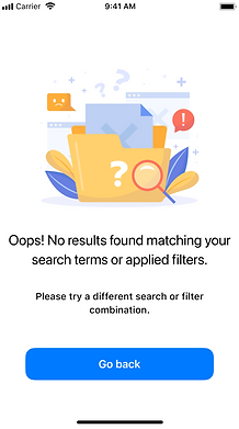
A primary screen shown when no matching search results are found.
Ideal Screen

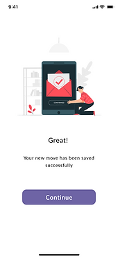
A primary screen confirming the successful addition of a new element.
Empty Screens

Primary screens displayed when users haven't added any elements to the app yet.


Ideating...
LEARNING FROM OTHERS
I looked at similar apps to gather inspiration and insights. I examined iOS and Android versions to identify interesting features, patterns, layouts and styling that could serve as potential design solutions for my app. This process was crucial as it provided valuable inspiration and informed decision-making while designing wireframes for my app's interface, ensuring that it effectively addressed user needs and preferences while considering platform-specific differences between iOS and Android versions.

APP RE-DESIGN INSPIRATION
Acrobacy


PoleDanceCompanion


Before
After
WHAT CHANGED?
Before

After

1. Home Screen
-
Progress status traffic light.
-
'More' icon for quick editing and deleting.
-
Feature to mark moves as "favourites" with easy access.
-
Search bar moved to "Home" screen along with quick access "Filter" screen.
Before
2. Add Move Screen
-
Text field to input the date in which the move was added for a diary-like context.
-
Slider to select progress statuses.
Bonus:
I noticed that many Android apps use a tab bar for navigating. To keep up with current Android design trends and Material Design guidelines, I added a similar feature to the Android wireframes.

After


3. Detailed Move View Screen
-
Traffic light code on the top and bottom margins of images.
-
Drop-down arrow option for status changes.
-
Sound-off button for audio control.
-
Item's addition date at the bottom of the page.
Before
4. Filters Screen
-
Checkbox to filter elements by progress status.
-
Search bar moved to "Home" screen.
-
Renamed screen for improved clarity.

After

MID-FIDELITY WIREFRAMES
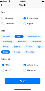
With the insights gained in the previous stage, I was able to transform them into concrete design solutions for both iOS and Android. These wireframes are a refined version of the app's interface, which aligns with user needs while considering platform-specific differences.
iOS
Android
Log-in

Home

Upload media

Detailed move view

Filter results


Capture media
Filters
Add move

Log-in

Home

Upload media

Filters
Detailed move view

Filter results

Capture media


Add move

STYLE GUIDE
Pole journal's design was thoughtfully crafted to embody elegance, simplicity, and functionality. This app was designed to serve as a digital diary for pole dancers, allowing them to document their journey with ease and sophistication. Every styling choice was carefully selected to create a welcoming and user-friendly experience that deeply resonates with the app's target audience.
Primary
HEX: 6E64A5
RGB: 110,100,165
HSL: 249.2,26.5%,52%
HEX: 6E64A5
RGB: 255,255,255
HSL: 0,0%,100%
Secondary
HEX: E5E5F4
RGB: 229,229,244
HSL: 240,40.5%,92.7%
COLOUR PALLETE
The Pole journal app has a modern and elegant colour scheme. It mainly uses white with a touch of purple to ensure good visual clarity and readability. Additionally, a secondary colour is used for inactive tags and control segments. This helps to improve visual hierarchy and user interaction within the app.
Traffic Light Colour Code
These colours represent different progress statuses. The chosen colours blend smoothly with the primary colour scheme, ensuring visual harmony and consistency through the interface.
Got it!
HEX: A1CCB8
RGB: 161,204,184
HSL: 152.1,29.7%,71.6%
On it
HEX: FFDC83
RGB: 255,220,131
HSL: 43.1,100%,75.7%
Almost there
HEX: FFAA5C
RGB: 255,170,92
HSL: 28.7,100%,68%
No status
HEX: CCCCCC
RGB: 204,204,204
HSL: 0,0%,80%
TYPOGRAPHY
The use of Fasthand typography for the logo and headings gives a charming and sophisticated vibe, adding to the overall feeling of an online journal. On the other hand, the choice of Lato for the rest of the app makes the content easy to read and understand, maintaining a balance between elegance and functionality.

iOS

Android

ICONOGRAPHY
The chosen icons are clean and simple. They were selected to be easily recognisable and consistent with the app's design language, enhancing navigation efficiency for users.
The icons were also chosen carefully to match the style of each platform, be it iOS or Android. This ensures that the design of the app remains cohesive and appropriate for the platform it is being used on.
Implementing...
USER INTERFACE
In this phase, I took the design elements and principles from the style guide and crafted them into HIGH-FIDELITY WIREFRAMES. After that, I developed PROTOTYPES for both platforms using Figma Prototype. These prototypes acted as the foundation for conducting a usability test in the next phase of the project.
iOS


Android


USABILITY TEST
Once the prototypes were ready, the next step was to conduct a usability test to gather feedback on the design and flow of the app. We shared links with 5 potential users, ensuring representation from both iOS and Android users to assess their familiarity with native UI. Based on their feedback, we made some design tweaks to finalize the UI design.
FEEDBACK
"When I go to another screen, will my filter choices be saved or do I need to select them again when I return to the 'Filter Screen'?"
"I was disappointed that I couldn't use the app to add a move, which is the main point of the app."
"I don't know how to go back from the 'Home Screen' to the 'Search Screen'. I find it confusing."
"Adding a new move after search results is difficult. I have to go back to the 'Home Screen' or 'Favourites' to find the 'add' option. Returning to the search requires going through multiple pages. It feels complicated."
"The dictate button feels a bit useless. Once I start typing I won't use it."




DESIGN TWEAKS
1. Search Screen

There wasn't a clear way to cancel the search and go back to the "Home Screen".
ISSUE

Added a close button to the search bar to replace the dictate button. This change provides a clear way to cancel or exit the search.
SOLUTION
2. Filter Screen
Lack of clarity regarding filter choice persistence may lead to uncertainty and frustration for users.

ISSUE

Added a close button to the search bar to replace the dictate button. This change provides a clear way to cancel or exit the search.
SOLUTION
3. Filter Results Screen

Adding new moves after conducting a search was difficult as it required several steps. Returning to the 'Filter Results Screen' was cumbersome, involved multiple taps.
ISSUE

Filter Results added as magnifying glass icon in navigation bar. Navigation bar added to 'Filter Results Screen' for adding new moves without navigating away. Android wireframes have floating 'add' button on all main pages.
SOLUTION
4. Add Move Flow
This interactive flow was created to simulate the move-adding process, enhancing user engagement and comprehension of the app's core feature.

NEW SCREEN

NEW SCREEN

NEW SCREEN


NEW SCREEN


